


INTRODUCTION
Hello everyone👋. Today I will be going through how to create a gradient-changing website and the weapon of choice? — ‘React’.
Now what features does our website contain:
Ability to scroll through and view a list of gradients with next and previous buttons
Ability to copy the CSS for a particular gradient of choice
Ability to add a new gradient to the list
Ability to view all available gradients
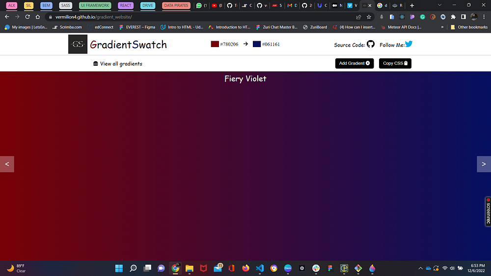
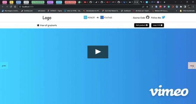
VISUAL REPRESENTATION
At the end of this article, you should be able to create a similar website. Now let’s get started!
WORKING WITH REACT
To get started with react, you should have the following tools:
Node. You can download Node at nodejs.org. Recommend the stable version.
NPM(Node Package Manager). It is automatically included in your installation of Node.
A good code editor. I would be using the editor Visual Studio Code. You can grab it at code.visualstudio.com.
USING CREATE-REACT-APP
This helps us focus on actually coding by installing react, its dependencies and whatever is needed to make it work. Think of it as boilerplate code
So in our terminal, we would enter the following:
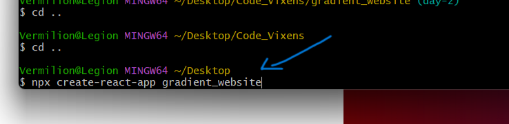
where gradient_website can be any project name of choice.
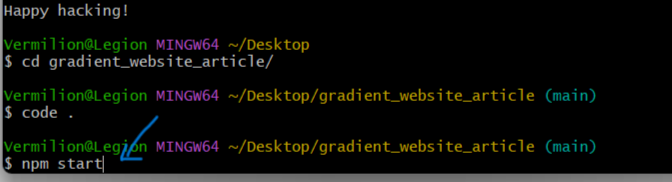
To make sure everything is set properly, we would start up the server after changing to the directory of our project
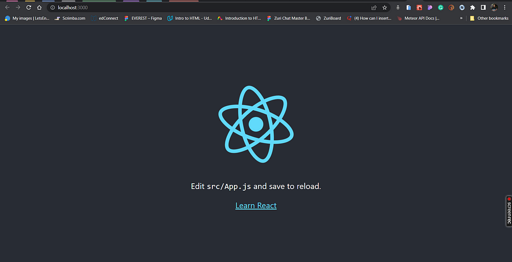
If everything went well, we should see this:
After removing the non-required pages, the folder structure should then resemble this
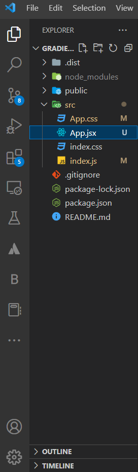
Since we would be using jsx in it and that would be where our website’s main body would dwell, App.js was renamed to App.jsx.
Some other changes were made to the remaining files — App.css was completely cleared as we would be writing our own styles.
App.jsx became:
import './App.css';

const App = () =>
{
  return (
    <div className="App">
      <h1>Hello</h1>
    </div>
  );
}

export default App;
After converting to ES6 syntax and removing the boilerplate.
index.js:
import React from 'react';
import ReactDOM from 'react-dom/client';
import './index.css';
import App from './App';

const root = ReactDOM.createRoot(document.getElementById('root'));
root.render(
  <React.Fragment>
    <App />
  </React.Fragment>
);
Now we can really get started!
From the structure, we can see we have a 2-step navbar and then the body; let us start with the navbar:
NAVBAR
In Navbar.jsx:
import React from 'react';
import './navbar.css';

const Navbar = () => {
  return (
    <div className='navbar'>
      <div className='top-nav'>
        <nav>
          <div className='logo'>
            <span>Logo</span>
          </div>
          <div className='swatch'>
            <span>
              <span
                className='left-color'
                style={{ backgroundColor: '#000' }}></span>
              #something
            </span>
            <span>icon</span>
            <span>
              <span
                className='right-color'
                style={{ backgroundColor: '#fff' }}></span>
              #anotherthing
            </span>
          </div>
          <div className='social'>
            <a href='#'>
              Source Code: <span className='icon'>icon</span>
            </a>
            <a href='#'>
              Follow Me: <span className='icon twitter'>icon</span>
            </a>
          </div>
        </nav>
      </div>
      <div className='bottom-nav'>
        <div className='bottom-nav-content'>
          <span className='viewall'>View all gradients</span>
          <div className='action-btns'>
            <button className='add'>Add gradient</button>

            <button className='copy'>copy CSS</button>
          </div>
        </div>
      </div>
    </div>
  );
};

export default Navbar;
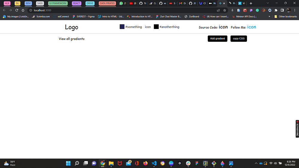
We create the basic structure [like HTML] for how the navbar should look with its different sections like logo, swatch, social, etc. and then we style it to give life. Note the ‘icon’ texts — we would replace those with their font awesome relevant soon.
For now, default colours have been put in the swatch, but soon we would see how to replace it with whatever is displayed in the body.
In Navbar.css:
a {
  text-decoration: none;
}

a:-webkit-any-link {
  color: #000;
}
.navbar {
  position: fixed;
  width: 100%;
  top: 0;
  left: 0;
  z-index: 10;
  background-color: #fff;
}
.top-nav {
  display: flex;
  height: 70px;
  width: 100%;
  padding: 0.3rem 2rem;
  border-bottom: 3px solid #e6e6e6;
}
.logo,
.swatch,
.social {
  flex-basis: 33.33%;
  justify-content: center;
}

.bottom-nav {
  padding: 0.3rem 2rem;
}
nav,
.bottom-nav-content {
  display: flex;
  justify-content: space-between;
  align-items: center;
  max-width: 1200px;
  width: 100%;
  margin: auto;
}
.bottom-nav-content {
  height: 40px;
}

.logo {
  font-family: cursive;
  font-size: xx-large;
  display: flex;
  align-items: center;
  gap: 0.5rem;
}

.swatch {
  display: flex;
  gap: 1rem;
}
.left-color,
.right-color {
  padding: 0rem 0.7rem;
  border: 1px solid black;
  margin-right: 0.3rem;
}

.social {
  font-family: cursive;
  display: flex;
  gap: 1rem;
}

.icon {
  font-size: 25px;
  transition: all ease-in-out 0.3s;
}
.twitter {
  color: #00acee;
}
.icon:hover {
  color: rgb(46, 44, 44);
  cursor: pointer;
}
.viewall {
  display: flex;
  gap: 0.4rem;
  font-family: cursive;
  align-items: center;
}
.viewall,
.action-btns {
  flex-basis: 33.33%;
  justify-content: center;
}
.action-btns {
  display: flex;
}
.action-btns button {
  padding: 0.5rem 0.8rem;
  background-color: #000;
  color: #fff;
  border-radius: 5px;
  border: none;
  transition: all 0.3s ease-in;
}
.action-btns button:hover {
  background-color: rgba(0, 0, 0, 0.438);
  cursor: pointer;
}
.add {
  margin-right: 1rem;
}

@media (max-width: 900px) {
  .top-nav {
    height: 180px;
  }
  nav,
  .bottom-nav-content {
    flex-direction: column;
    gap: 1rem;
  }
  .bottom-nav-content {
    height: 105px;
  }
  .logo {
    justify-content: center;
  }

  .logo,
  .swatch,
  .social {
    height: fit-content;
  }
}

@media (max-height: 600px) and (max-width: 900px) {
  .bottom-nav {
    display: none;
  }
}
Of course, responsiveness is also a very important part, so we would be adding and updating the media queries along the way.
What is happening here is that we have our 2 sections of navbar: the top-nav and bottom-nav having a maximum width of 1200px and justified to the centre for uniformity. we also have each section taking 33.33% of the total width, which then rounds to 100%.
Where we currently are:
BODY
Now we should move to the body and visually see the gradient. it would also only display default colours for now since we have not constructed our logic yet.
in App.jsx:
import './App.css';
import Navbar from './Navbar';

const App = () => {
  return (
    <div className='App'>
      <Navbar />
      <div
        className='gradient-body'
        style={{
          background: '#232354',
          background: `-webkit-linear-gradient(to right, #232354, #000)`,
          background: `linear-gradient(to right, #232354, #000)`,
        }}>
        <div className='buttons'>
          <div className='prev'>
            <span>prev</span>
          </div>
          <div className='next'>
            <span>next</span>
          </div>
        </div>
      </div>
    </div>
  );
};

export default App;
We now have our body with the buttons[next and prev] inside, with the background holding the gradient.
in App.css:
* {
  box-sizing: border-box;
  margin: 0;
  padding: 0;
}
body {
  position: relative;
}
.gradient-body {
  display: grid;
  min-height: calc(100vh - 100px - 0.6rem);
  width: 100%;
  margin-top: 109px;
  position: relative;
}
.buttons {
  display: flex;
  align-items: center;
  justify-content: space-between;
  color: #000;
}
.prev,
.next {
  padding: 1rem;
  background-color: rgba(255, 255, 255, 0.282);
  border: none;
  transition: all 0.3s ease-in;
}
.prev:hover,
.next:hover {
  background-color: rgb(212, 198, 198);
  cursor: pointer;
}
@media (max-width: 900px) {
  .gradient-body {
    min-height: calc(100vh - 280px - 1rem);
    margin-top: 295px;
  }
}
@media (max-height: 600px) and (max-width: 900px) {
  .gradient-body {
    min-height: calc(100vh - 165px - 1rem);
    margin-top: 180px;
  }
}
The styling is very straightforward.
first, we erase any default styling like margin and padding with * and by setting them to 0.
then we get the height of the body by subtracting the navbar from the full height and also adding a margin-top since the navbar is fixed and content would hide behind it
then we flex, position the buttons and add a short transition to each
With all this, we have a standard static version of our site:
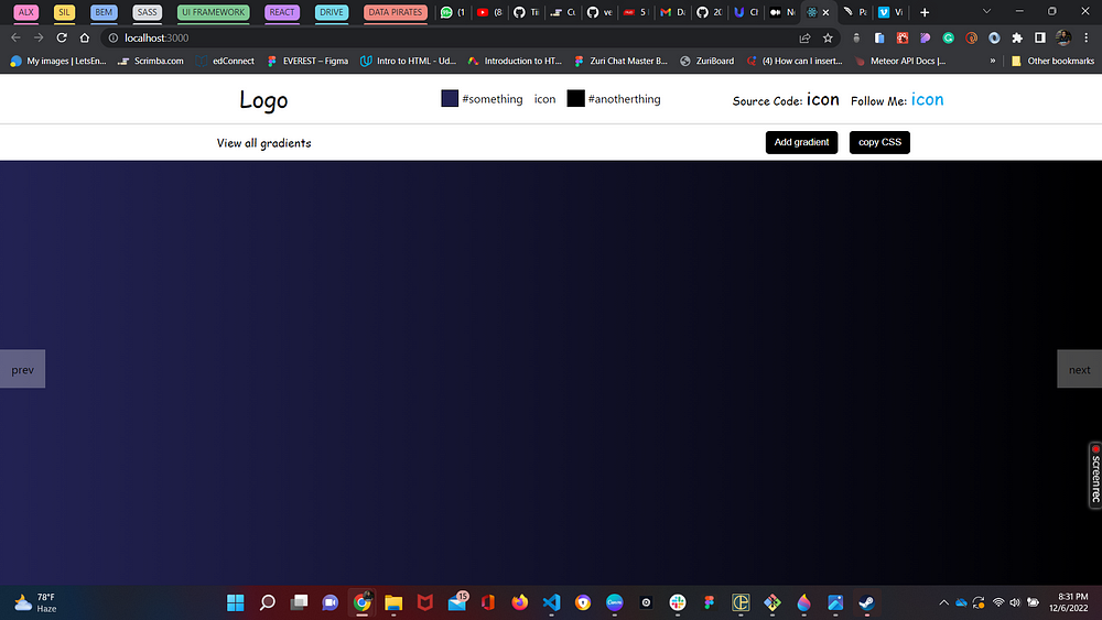
Not very complete or functional yet though.
FONT AWESOME ICONS
Now to read more on how to use font awesome icons with react, you can check out Font awesome.
To get started we would need to install some dependencies:
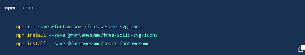
Font awesome dependencies
npm i --save @fortawesome/free-brands-svg-icons /*for logos and brands*/
Sample Usage:
Navbar.jsx
import { faGithub, faTwitter } from '@fortawesome/free-brands-svg-icons';

...
return (
<FontAwesomeIcon icon={faGithub} />
<FontAwesomeIcon icon={faTwitter} />
)
Using this method, all icons would then be replaced.
GRADIENT LIST
This is the list of gradients for which the user would be navigating through:
#FBD3E9, #BB377D
#00d2ff, #3a7bd5
#f2709c, #ff9472
#a73737, #7a2828
#4b6cb7, #182848
#C04848, #480048
#5f2c82, #49a09d
#232526, #414345
#5C258D, #4389A2
#4776E6, #8E54E9
we would put this in a js file called Colors.js:
which is just an array of objects holding the properties:
id — which we would use for navigation
colorOne — the gradient’s left color
colorTwo — the gradient’s right color
name: the gradient’s name
Colors.js
export const colors = [
  {
    id: 0,
    colorOne: '#780206',
    colorTwo: '#061161',
    name: 'Fiery Violet'
  },
  {
    id: 1,
    colorOne: '#FBD3E9',
    colorTwo: '#BB377D',
    name: 'Playful Pink'
  },
  {
    id: 2,
    colorOne: '#00d2ff',
    colorTwo: '#3a7bd5',
    name: 'Ocean Blue'
  },
  {
    id: 3,
    colorOne: '#f2709c',
    colorTwo: '#ff9472',
    name: 'Terratron'
  },
  {
    id: 4,
    colorOne: '#a73737',
    colorTwo: '#7a2828',
    name: 'Maroony'
  },
  {
    id: 5,
    colorOne: '#4b6cb7',
    colorTwo: '#182848',
    name: 'Deep Sky'
  },
  {
    id: 6,
    colorOne: '#C04848',
    colorTwo: '#480048',
    name: 'Flary'
  },
  {
    id: 7,
    colorOne: '#5f2c82',
    colorTwo: '#49a09d',
    name: 'Stale Ice'
  },
  {
    id: 8,
    colorOne: '#232526',
    colorTwo: '#414345',
    name: 'Wednesday'
  },
  {
    id: 9,
    colorOne: '#5C258D',
    colorTwo: '#4389A2',
    name: 'Magic Glow'
  },
  {
    id: 10,
    colorOne: '#4776E6',
    colorTwo: '#8E54E9',
    name: 'Skittle Blue'
  },
];
An idea should be developing at this point — since there would be changes first we know we would be dealing with states, so let us define all states we would use
App.jsx
import { colors } from './Colors';
import { useState, useEffect } from 'react';
...
const App = () => {
/*Left gradient*/
  const [colorOne, setColorOne] = useState('');
/*Right gradient*/
  const [colorTwo, setColorTwo] = useState('');
/*Left gradient when adding new gradient*/
  const [fromColor, setFromColor] = useState('#fff');
/*Right gradient when adding new gradient */
  const [toColor, setToColor] = useState('#000');
/*Default state of the colors list */
const [list, setList] = useState(colors);
/*id for newly added gradient*/
  const [newId, setNewId] = useState(colors.length);
const [colorName, setColorName] = useState('');
/*counter that determines gradient to display */
  let [counter, setCounter] = useState(0);

  const handleNext = () => {
    setCounter((counter += 1));
    counter === list.length ? setCounter(1) : setCounter(counter);
  };
  const handlePrev = () => {
    setCounter((counter -= 1));
    counter === -1 || counter === 0
      ? setCounter(list.length - 1)
      : setCounter(counter);
  };
return (
...
          <div className='prev' onClick={handlePrev}>
            prev
          </div>
          <div className='next' onClick={handleNext}>
            next
          </div>
...
)
The handleNext and handlePrev are functions that determine what should show on clicking either the next or prev buttons.
handleNext() — counter is increased by 1 and when the end of the list is reached, the counter goes back to 1.
handlePrev() — counter is decreased by 1 and when the beginning of the list is passed, or it reaches negative, the counter goes back to the last gradient’s id. — the reason for this is to satisfy the condition where the default colours that show on load never come up in the list when navigating, but must always show on load.
Now for where the color actually changes based on the counters change:
 useEffect(() => {
    setColorOne(list[counter].colorOne);
    setColorTwo(list[counter].colorTwo);
  }, [counter, list]);
using useEffect, every time there is a change in the counter, which would be when we click on the next or prev buttons, or a change in the list (when we add a new gradient), the colorOne and colorTwo values are updated. and then we want to display whatever those values are at the time — to do that, we replace our default color values with the variables:
<div
        className='gradient-body'
        style={{
          background: '#232354',
          background: `-webkit-linear-gradient(to right, #232354, #000)`,
          background: `linear-gradient(to right, #232354, #000)`,
        }}>

/*becomes*/

<div
        className='gradient-body'
        style={{
          background: `${colorOne}`,
          background: `-webkit-linear-gradient(to right, ${colorOne}, ${colorTwo})`,
          background: `linear-gradient(to right, ${colorOne}, ${colorTwo})`,
        }}>
At this point, we have our next and prev buttons functional but with the gradients in the navbar not responding to the background. To fix that, we just have to pass colorOne and colorTwo as props to the navbar.
<Navbar colorOne={colorOne} colorTwo={colorTwo} />
And destructure in Navbar.jsx
const Navbar = ({ colorOne, colorTwo }) => {
/*In swatch*/
 <div className='swatch'>
            <span>
              <span
                className='left-color'
                style={{ backgroundColor: `${colorOne}` }}></span>
              {colorOne}
            </span>
            <span>
              <FontAwesomeIcon icon={faArrowRight} />
            </span>
            <span>
              <span
                className='right-color'
                style={{ backgroundColor: `${colorTwo}` }}></span>
              {colorTwo}
            </span>
          </div>
Now we have:
MODALS AND CODE-BLOCKS
Now one of the beauties of React is the vast amount of packages available for literally anything. for our add gradient and copy CSS, we would be using modals.
React has a lot of modals, but for this, we would use react-modal. To use this, we just have to install it:
npm install react-modal
For the code blocks — this just signifies text content that looks like code — for this we would use:
npm install react-code-blocks
in App.jsx
  const [showCssModal, setShowCssModal] = useState(false);
  const [showGradientModal, setShowGradientModal] = useState(false);
...
<Navbar
        colorOne={colorOne}
        colorTwo={colorTwo}
        showCssModal={showCssModal}
        setShowCssModal={setShowCssModal}
        showGradientModal={showGradientModal}
        setShowGradientModal={setShowGradientModal}
      />
We would define states for the copy to CSS and the add gradients modal to track when either is open or closed using boolean.
in Navbar.jsx
import ReactModal from 'react-modal';
import { CopyBlock, dracula } from 'react-code-blocks';

const Navbar = ({
  colorOne,
  colorTwo,
  showCssModal,
  setShowCssModal,
  showGradientModal,
  setShowGradientModal,
}) => {
  const handleOpenCssModal = () => {
    setShowCssModal(true);
  };
  const handleCloseCssModal = () => {
    setShowCssModal(false);
  };
  const handleOpenGradientModal = () => {
    setShowGradientModal(true);
  };
  const handleCloseGradientModal = () => {
    setShowGradientModal(false);
  };
  const codeBlock = `
  background: ${colorOne}; /* fallback for old browsers */
  background: -webkit-linear-gradient(to right, ${colorOne}, ${colorTwo}); /* Chrome 10-25, Safari 5.1-6 */
  background: linear-gradient(to right, ${colorOne}, ${colorTwo}); /* W3C, IE 10+/ Edge`

return (
...
/*In the copy section*/
<button className='copy' onClick={handleOpenCssModal}>
              copy CSS <FontAwesomeIcon icon={faClipboard} />
            </button>
            <ReactModal ariaHideApp={false}
              isOpen={showCssModal}
               style={{
                overlay: {
                  backgroundColor: 'rgba(22, 21, 21, 0.222)',
                  zIndex: '20',
                },
              }}>
              <button className='close-icon' onClick={handleCloseCssModal}>
                <FontAwesomeIcon icon={faClose} />
              </button>
              <div className='copy-css'>
                  <h2>Copy CSS code</h2>
                  <CopyBlock
                    text={codeBlock}
                    language='javascript'
                    theme={dracula}
                    wrapLines
                  />
                  <button
                    onClick={(e) => {
                      navigator.clipboard.writeText(codeBlock);
                      handleCloseCssModal();
                    }}>
                    Copy to Clipboard
                  </button>
                </div>
            </ReactModal>
)
}
navigator.clipboard.writeText(codeBlock) — this line copies whatever is in the braces to the clipboard. codeBlock is a variable defined earlier that has the colorOne and colorTwo variables making the content unique to each gradient. copyBlock also comes with its own copy effect in the form of an icon.
The inbuilt style — overlay is set to have a z-index of 20 so it can show on top of the navbar as well. If the modal style is not up to taste, you can further style it — but I would be leaving the default styles.
Now to style the contents of our react modal, we would also have similar styling with the add gradient modal:
in navbar.css
.close-icon {
  padding: 0.5rem;
  position: absolute;
  right: 5%;
  background-color: transparent;
  border: none;
  cursor: pointer;
}
.copy-css,
.add-gradient {
  display: grid;
  height: 100%;
  place-content: center;
  gap: 1rem;
}
.copy-css h2,
.add-gradient h2 {
  text-align: center;
}

.copy-css button,
.add-gradient button {
  width: 150px;
  padding: 0.5rem 0;
  margin: auto;
  cursor: pointer;
  background-color: #000;
  color: #fff;
  border-radius: 5px;
  border: none;
  transition: all 0.3s ease-in;
}

.copy-css button:hover {
  background-color: rgba(0, 0, 0, 0.438);
}
We now have our copy CSS to-clipboard done and would do something similar for the add gradient modal:
<button onClick={handleOpenGradientModal} className='add'>
              Add Gradient <FontAwesomeIcon icon={faPlusCircle} />
            </button>
<ReactModal ariaHideApp={false} style={{
                overlay: {
                  backgroundColor: 'rgba(22, 21, 21, 0.222)',
                  zIndex: '20',
                },
              }} isOpen={showGradientModal}>
        <button className='close-icon' onClick={handleCloseGradientModal}>
          <FontAwesomeIcon icon={faClose} />
        </button>
        <div className='add-gradient'>
                  <h2>Add Gradient</h2>
                  <label htmlFor='from'>From:</label>
                  <div className='from-input'>
                    <input
                      id='from'
                      type='text'
                      onChange={(e) => setFromColor(e.target.value)}
                      placeholder='e.g: #fff'
                    />
                    <span
                      className='from-color'
                      style={{ backgroundColor: `${fromColor}` }}></span>
                  </div>
                  <label htmlFor='to'>To:</label>
                  <div className='to-input'>
                    <input
                      id='to'
                      type='text'
                      onChange={(e) => setToColor(e.target.value)}
                      placeholder='e.g: #000'
                    />
                    <span
                      className='to-color'
                      style={{ backgroundColor: `${toColor}` }}></span>
                  </div>

                  <button onClick={handleAdd}>Save</button>
                </div>
      </ReactModal>
Here is where the from-color and to-color are being used — it is to give the user a visual of what the typed-in colour looks like.
in App.jsx:
we have to pass the props needed by the Navbar
  <Navbar
        colorOne={colorOne}
        colorTwo={colorTwo}
        showCssModal={showCssModal}
        setShowCssModal={setShowCssModal}
        showGradientModal={showGradientModal}
        setShowGradientModal={setShowGradientModal}
        fromColor={fromColor}
        toColor={toColor}
        setFromColor={setFromColor}
        setToColor={setToColor}
        handleAdd={handleAdd}
      />
in Navbar.jsx
const Navbar = ({
  colorOne,
  colorTwo,
  showCssModal,
  setShowCssModal,
  showGradientModal,
  setShowGradientModal,
  fromColor,
  setFromColor,
  toColor,
  setToColor,
  handleAdd,
}) => {}
navbar.css
.add-gradient input[type='text'] {
  padding: 0.5rem 0.2rem;
}
.from-input,
.to-input {
  display: flex;
  align-items: center;
  gap: 1rem;
}
.from-color,
.to-color {
  width: 20px;
  height: 20px;
  border: 1px solid #000;
}
FINAL SECTION — VIEW ALL GRADIENTS
Now for the final leap, it would be to view all the gradients in the list. For this, an overlay would be used, and then each list item mapped out.
The overlay would be positioned right before the prev and next buttons:
     const [showOverlay, setShowOverlay] = useState(false);
...
<div className={`${showOverlay ? 'overlay' : 'off-screen'}`}>
          <div className='pallete-container'>
            {list.map((item) => {
              return (
                <div
                  key={item.id}
                  className='pallete'
                  style={{
                    background: `${item.colorOne}`,
                    background: `-webkit-linear-gradient(to right, ${item.colorOne}, ${item.colorTwo})`,
                    background: `linear-gradient(to right, ${item.colorOne}, ${item.colorTwo})`,
                  }}>
                </div>
              );
            })}
          </div>
        </div>
        <div className='buttons'>
Using the showOverlay state, we are able to track whether the overlay is open or not. If the showOverlay is true meaning it is open, then we apply the overlay class, else we apply the off-screen class.
for the content — inside of the pallete-container we would map out every item and have it follow the structure set in the CSS, while making the background tally with the current item’s colorOne and colorTwo. so for every item in the list, they would assume the style set to pallete
App.css
.overlay {
  min-height: calc(100vh - 100px - 0.6rem);
  background-color: #fff;
  position: absolute;
  width: 100%;
  top: 0;
  transition: all ease-in 0.6s;
}
.off-screen {
  position: absolute;
  top: -1000px;
  width: 100%;
  transition: all ease-out 0.6s;
  opacity: 0;
}
.pallete-container {
  display: grid;
  padding: 2rem;
  grid-template-columns: repeat(3, 1fr);
  gap: 1rem;
  border: none;
}
.pallete {
  border-radius: 10px;
  height: 200px;
  display: grid;
  place-content: center;
  transition: all ease 0.3s;
}

.pallete:hover {
  cursor: pointer;
  transform: scale(1.03);
  box-shadow: 3px 3px 3px 2px rgba(0, 0, 0, 0.519);
}

@media (max-width: 900px) {
  ...
  .pallete-container {
    grid-template-columns: repeat(2, 1fr);
  }
  .overlay {
    top: 0;
    transition: all ease-in 0.6s;
  }
  .off-screen {
    top: -3000px;
    transition: all ease-out 0.6s;
    opacity: 0;
  }
}

@media (max-width: 600px) {
  .pallete-container {
    grid-template-columns: 1fr;
  }
  .off-screen {
    top: -3000px;
    transition: all ease-out 0.6s;
    opacity: 0;
  }
}
The off-screen class has a top in the negative so that when it's switching to overlay which has a top of 0, it produces a kind of slide-down effect, and the opacity is 0 to give a disappearing and appearing kind of effect as well.
It still does not show now though? and that is because we have not linked it to the view all button in the navbar
<Navbar
        colorOne={colorOne}
        colorTwo={colorTwo}
        showCssModal={showCssModal}
        setShowCssModal={setShowCssModal}
        showGradientModal={showGradientModal}
        setShowGradientModal={setShowGradientModal}
        fromColor={fromColor}
        toColor={toColor}
        setFromColor={setFromColor}
        setToColor={setToColor}
        handleAdd={handleAdd}
        showOverlay={showOverlay}
        setShowOverlay={setShowOverlay}
      />
const Navbar = ({
  ...
  handleAdd,
  showOverlay,
  setShowOverlay
}) => {
  const handleShowAll = () => {
    setShowOverlay(true);
  };
  const handleCloseAll = () => {
    setShowOverlay(false);
  };
...
<div className='viewall'>
            {showOverlay ? (
              <>
                <FontAwesomeIcon
                  className='clickable'
                  onClick={handleCloseAll}
                  icon={faClose}
                />
                <span className='clickable' onClick={handleCloseAll}>
                  View all gradients
                </span>
              </>
            ) : (
              <>
                <FontAwesomeIcon
                  className='clickable'
                  onClick={handleShowAll}
                  icon={faHamburger}
                />
                <span className='clickable' onClick={handleShowAll}>
                  View all gradients
                </span>
              </>
            )}
          </div>
}
All of this simply asks: Is the showOverlay true? The overlay, is it open? If so, change the hamburger icon to a close icon, and when I click it, handleCloseAll runs, closing the overlay and setting the showOverlay property to false. The icon changes back to a hamburger if it is closed, and vice versa.
With this, we have successfully created a gradient-changing website.
What other cool features do you think could be added???
You can contact me or follow what I’m up to on: